Never Give Up
NGU Real Estate is an award-winning real estate agency that has rapidly expanded across Queensland. In 2022, the company strategically rebranded itself to reach a broader audience, raising the demand for an SEO-friendly website redesign. Our design team were challenged to reimagine the brand’s digital presence and create a better experience for the consumer. My role was to help conduct user research and visual design, including working on the user experience and prototyping.
Design for Sellers & Buyers.
NGU is an acronym for Never Give Up, the fundamental principle that drives NGU Real Estate to deliver the best advice and results for their customer. By implementing this principle into our design, we learned about the target user—Sellers and Buyers—through user surveys and interviews, capturing their feedback from using the existing website to understand more about their actual needs.


Data were sampled from 24 people
“A page that allows you to get more knowledge of what it looks like living in each suburb area would be great… I would love to settle in a place that is tailored for me and has all I need.”
—Quote from a user's survey
Problem Diagnosis
We analysed the collected data and noticed that:
Over three-quarters of the users found it difficult or time-consuming to browse houses on the current website of NGU.
Not all users had a clear idea about which area to live in, they looked for many factors while browsing houses online and location is one of the main factors that help them make the decision.
Visually, there was also a lack of hierarchy and priority in the way information was presented.
I also looked at other websites of popular real estate platforms to further my research on what a useful property site is comprised of. Some takeaways of what made them successful included:
Well-structured navigation
Advanced search filters
Organized information presentation
Insights and expertise demonstration
By identifying the pain points, we were able to discover the user problems that need to address and apply these successful features to relieve the pain points they encounter.
Main Objective
We determined that our main objective is to increase the usability and mobile accessibility of the NGU website. A large portion of our users is found to be using mobile for house hunting.
Starting with Questions…
We created a list of ‘How Might We…’ questions to help us better align our user’s tasks and goals:
How might we provide a tailored experience that could be customised to suit user needs?
How might we allow users to access a comprehensive knowledge of a suburb before they live there?
How might we provide a reliable experience and develop brand trust through a website redesign?
The Redesign Process.
Card Sorting
I ran a card sorting session that was composed of members from our Sales and Design teams. This technique allows us to determine which website functionalities should stay, be improved or eliminated based on the information architecture and the value it was adding to the website.

Internal Feedback
I talked to our client-facing teammates to inquire about what should be added or removed from the existing website. The purpose of this was to make sure the solutions we delivered were truly valuable, useful and in demand.
“We need to extract our testimonials from RateMyAgent.com, as people could get real cases reference and build more confidence in our service/agent. This is credible and efficient.”
—Response from the NGU sales team

After creating a sitemap, I summarised these insights through sketching and wireframing. By doing this, we were able to outline the main scope of the project, specify questions, and pin down the focus of our ideas.

The MVP
To validate these ideas, I designed a simple overview of the NGU homepage to test the usability of main functionalities such as the Advanced Search Engine, Listing Presentation, Awards Slide Show, and RateMyAgent Testimonial Integration. I also removed a couple of features discussed in our ‘Card Sorting’ session.
After soft-launching to a smaller group of actual users, we started to see a difference immediately. Instead of aimlessly browsing our listings looking for the right properties, our clients spent more time reading the useful information after they searched for a target house or suburb.
Iterate, Iterate and Iterate
Based on the user feedback we received, I made changes to improve the visual presentation of the homepage, making sure the experience was accessible, valuable and made sense.

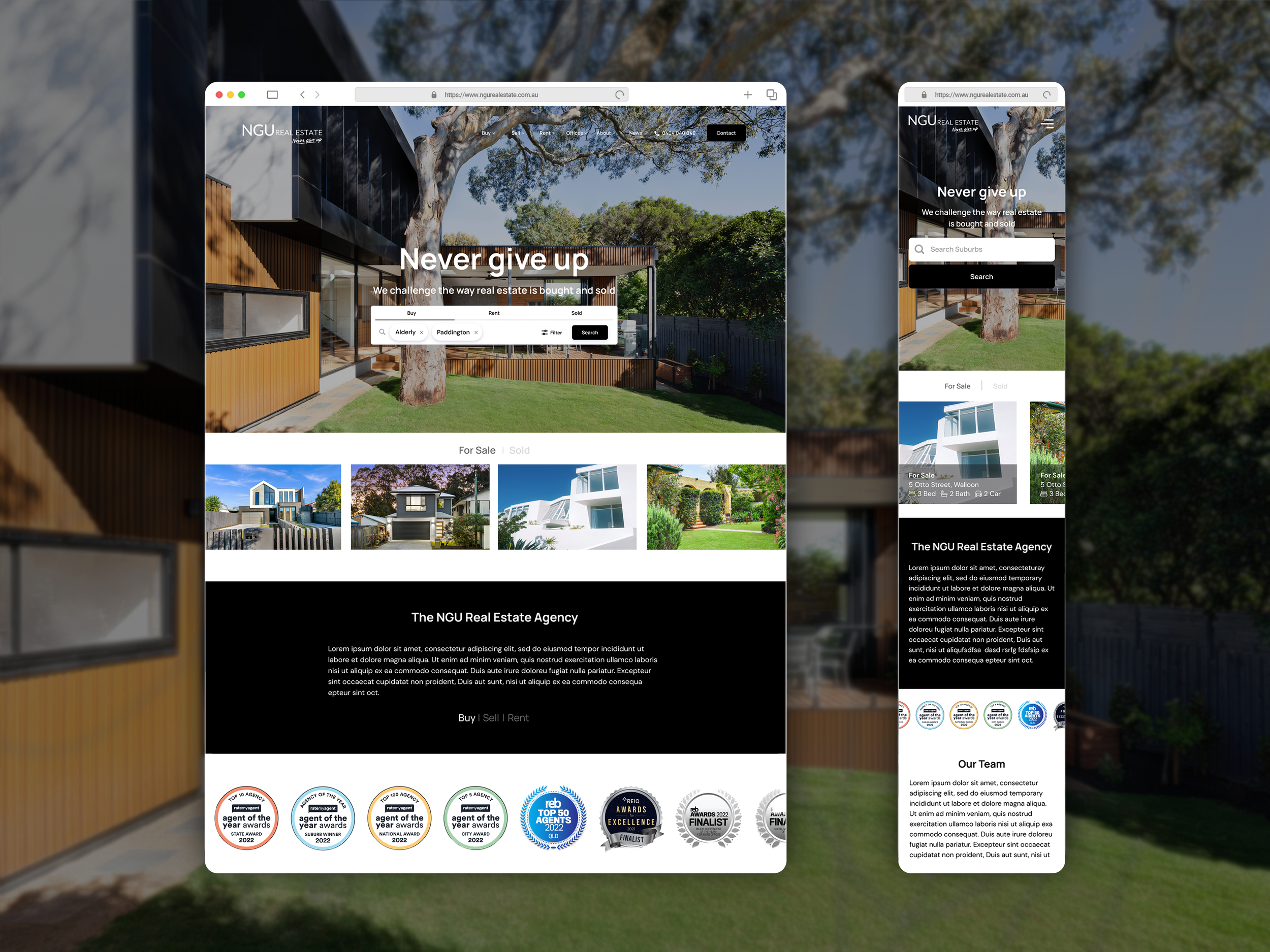
The Advance Search Engine.
We designed the interaction of our Advanced Search Engine that gives users the flexibility to search for their ideal house.
Step 1.
Put in the locations you’re interested in. You might click on the “Search” button to get immediate results or choose “Filter” for more customised settings.

Step 2.
When filters pop up, scroll down to select specific house information based on your personal preference. After the settings are done, click the “Search” button to apply the filter or “Clear all” to erase all your preferences and reselect.


Step 3.
There are three view modes—Gallery, List, and Map view—to present your search results. You can switch between these view modes whenever you need by clicking the following buttons.


Step 4.
Once you have found a specific listing you are interested in, click the thumbnail photo so it will guide you to the page of an individual listing— or this could be your next dream house!

Full-length Website Advanced Filter

Mobile-version Advanced Filter


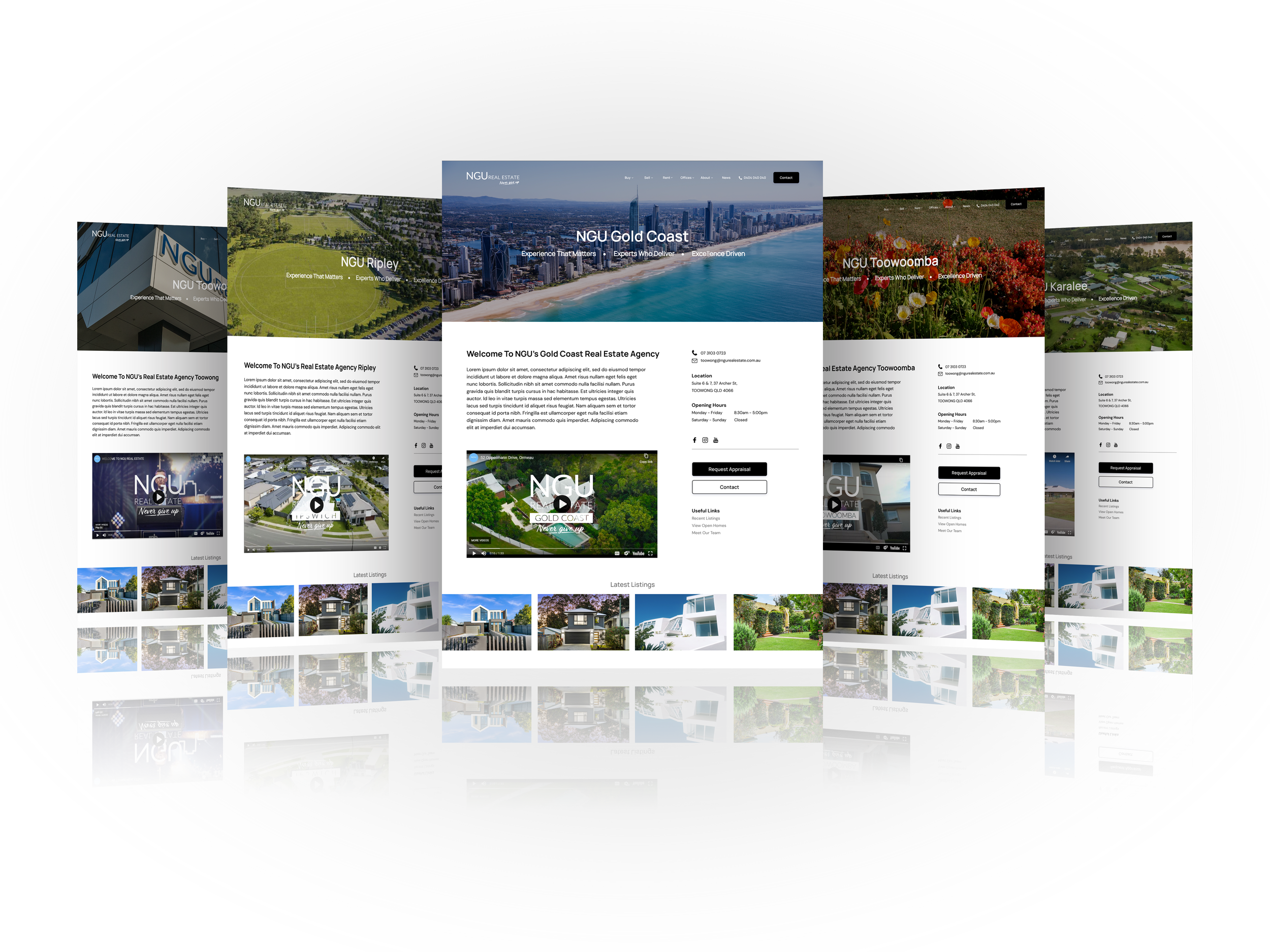
Location Profiles.
We developed a total of 14 Location Profiles to keep the target users—buyers and sellers informed about the suburban areas before they made further decisions.


Next Step.
After testing the functional prototype with NGU stakeholders, we gained practical feedback and constantly iterated our design to deliver the best solution to our customers.
In this stage, we arranged lots of meetings with the development team to make sure all functionalities in the user experience were feasible. We also set up a schedule to manage the website development progress. This helped us break down a big task into pieces and helped us make sure the project could be delivered on time.
From the testing result, we could see the website has been well received by the customers. However, there are still improvements that can be made. For example, users would love to have a Compare Similar Homes Chart to help them compare key features of homes and better analyze their options. This could be our future parts of the product as we constantly strive to improve the NGU house hunting experience.

NEXT PROJECT>>
NEXT PROJECT>>