Solomons Project
Solomons Group is a financial consulting firm that offers accounting, tax advice, venture capital, and wealth management services. As the company continue to grow, they decide on an interdisciplinary approach that partners with Accountants, Lawyers and other advisory groups to offer a more comprehensive suite of services. My role was to help Solomons unite different services into one modern and cohesive brand identity, through marketing strategies, visual designs, user experience design and prototyping.

Communicating the brand values.
Solomons Group believes that every individual, family, business and institution is unique and deserves individualised attention. By focusing on the brand’s core values from King Solomon—Be Fair, Wise and Create Wealth—we were able to build a client-oriented, professional brand image that people would trust and count on.

Insights
In the financial market, people see investing as a cake that every participant may have the opportunity to get a slice of benefits. With the principle values of Fairness, Solomons Group addresses every individual client's challenges whilst equally seeking new opportunities for their clients.
Inspirations
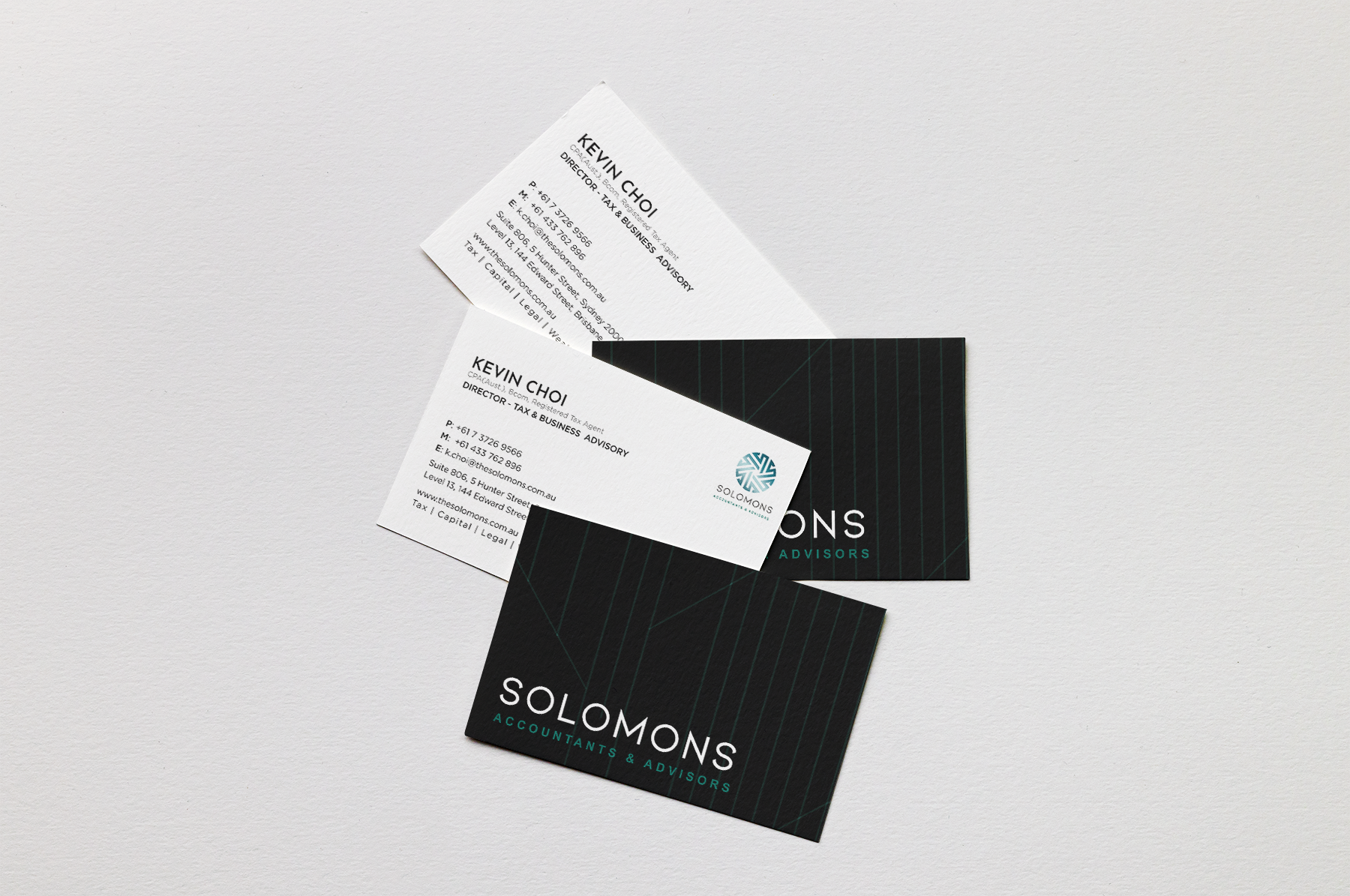
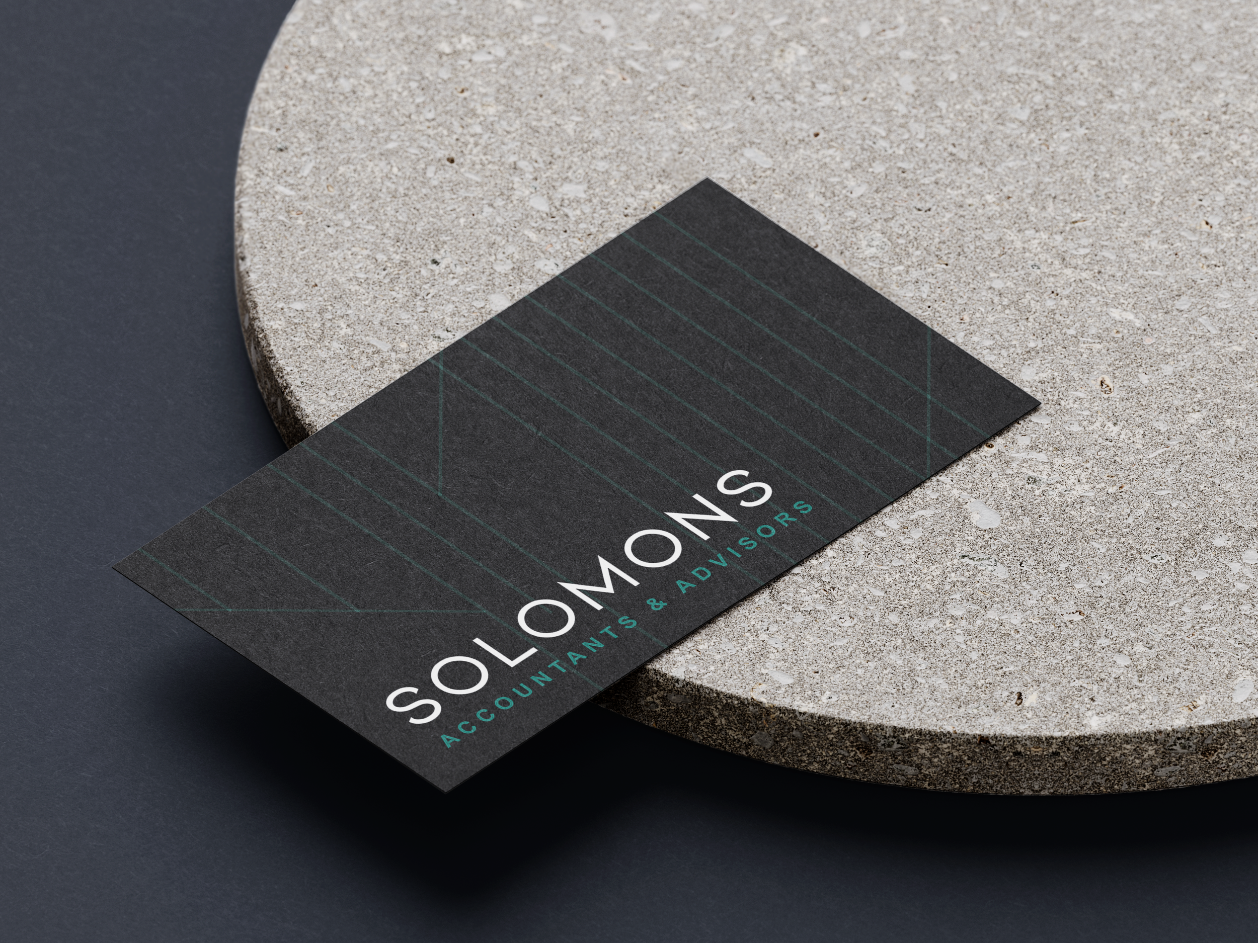
Inspired by the brand values and insights, we crafted a coin-shape logo which consists of equirotal pieces to transmit the message of “Fairness”; each slice refers to an “S” for Solomons; and the whole “cake” is made up of every single piece of “S”, which represents Unity, Commitment, and “Create Wealth” together. We also considered the nature of the financial market—providing security for transactions and ensuring liquidity—to design “streams” flow across the logo.
Implementation
After brainstorming, we executed the ideas with a lot of trials and errors in order to get the best solutions. We collected feedback from potential clients and stakeholders to make sure our design communicates in a way that is easy to understand. After a few iterations, we decided on the current logo as our final version.
Solomons Core Services
With a multi-branding approach, we determined to use four different colours to represent the departments.


Corporate Fonts


Immersive User Experience.
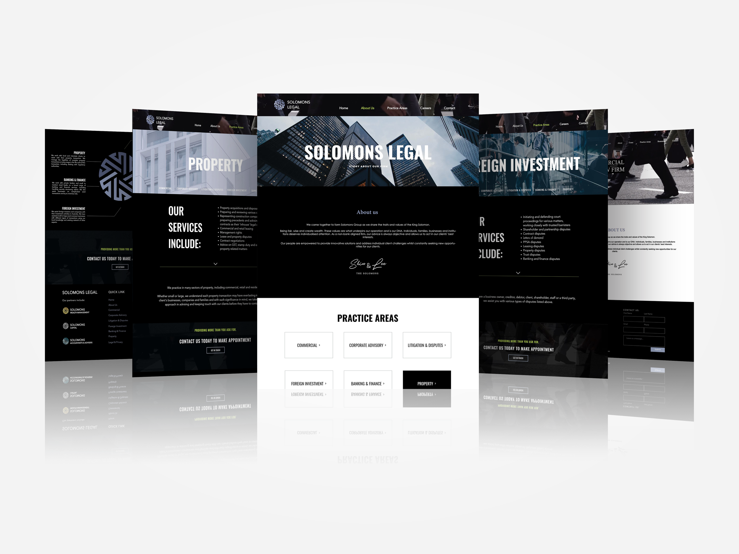
Being one of the latest joined partners, Solomons Legal was looking to build a website that can showcase its value and service in an innovative way. They aimed to challenge people’s impression of a traditional law practice by integrating contemporary approaches into the professional legal advisory paradigm. After truly understanding their needs, we started to build a narrative around what makes their services unique.
The Design System.
We developed a comprehensive UI design system to guide us throughout our design process.

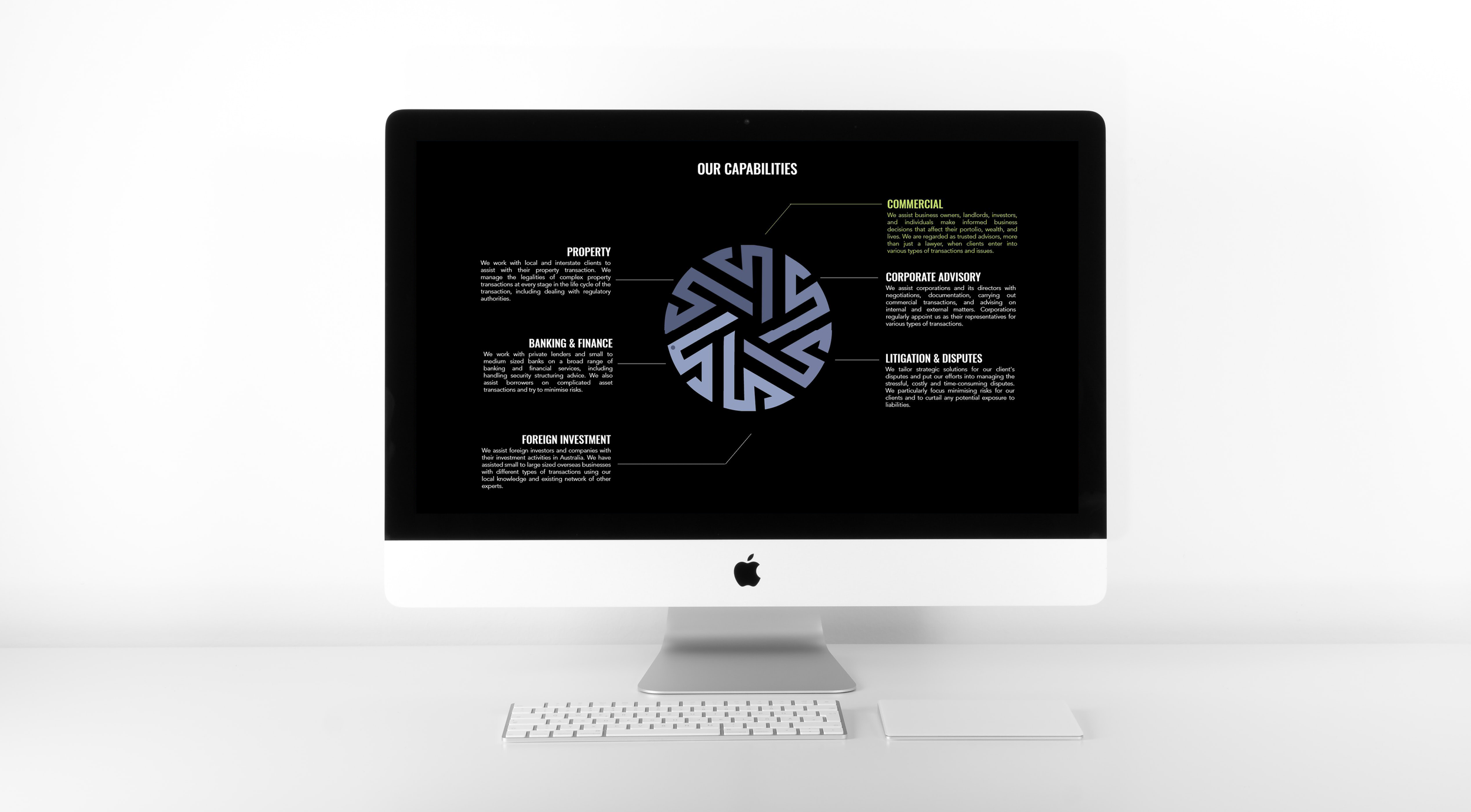

The Wheel Menu
To create a more engaging user experience, we broke down the logo of Solomons Legal into six components. Each sector works as a button that points to a specific practice area while users can hover over the wheel menu for more information or click on one of the buttons to access a specific service page. By adding this interactive function, we were able to give users a clear understanding of what services Solomons Legal offers and how their values become the DNA that underpins the company's operation. This allows us to navigate users across pages in an easy and entertaining way.


Activated
button colour
Default
button colour
Hover
button colour
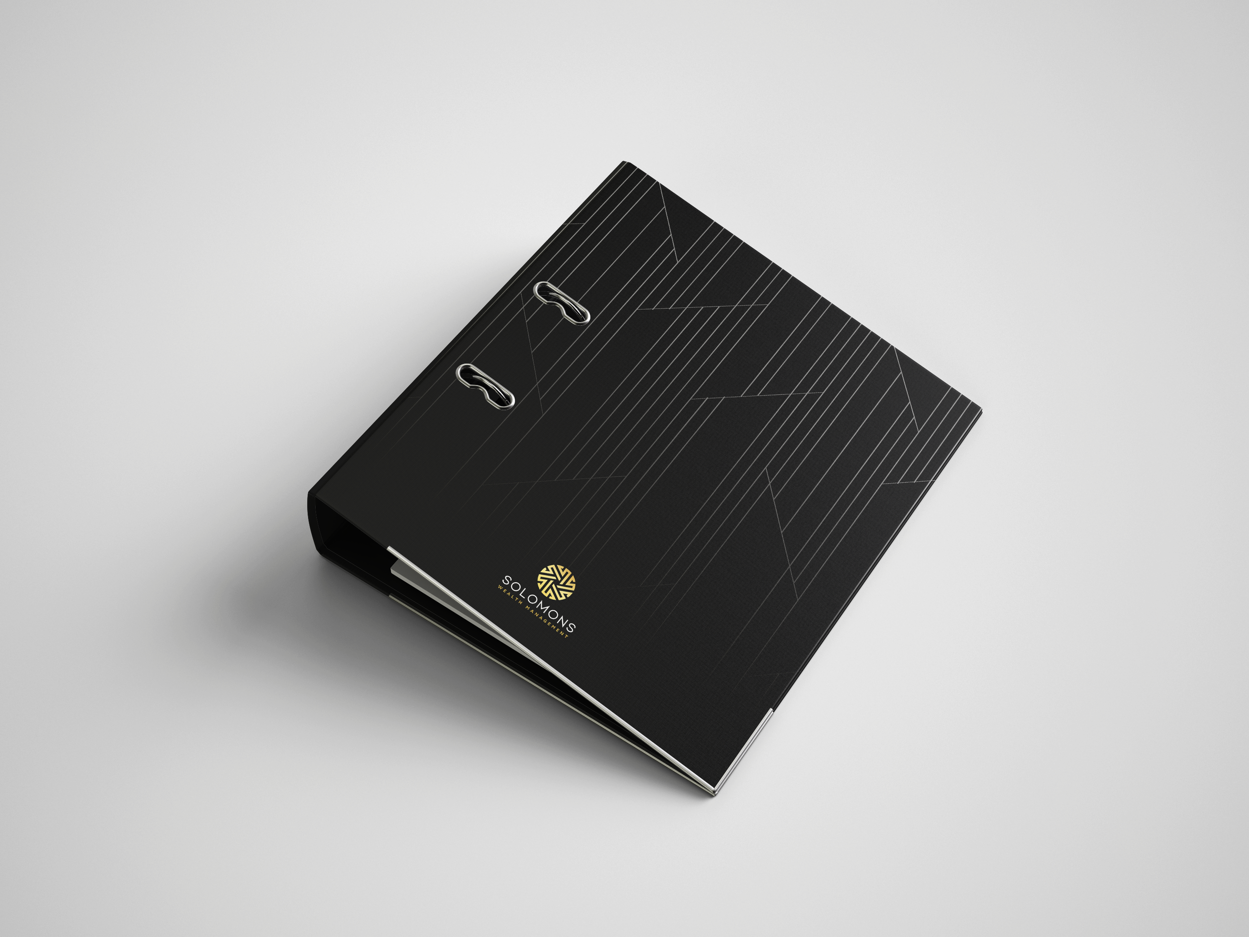
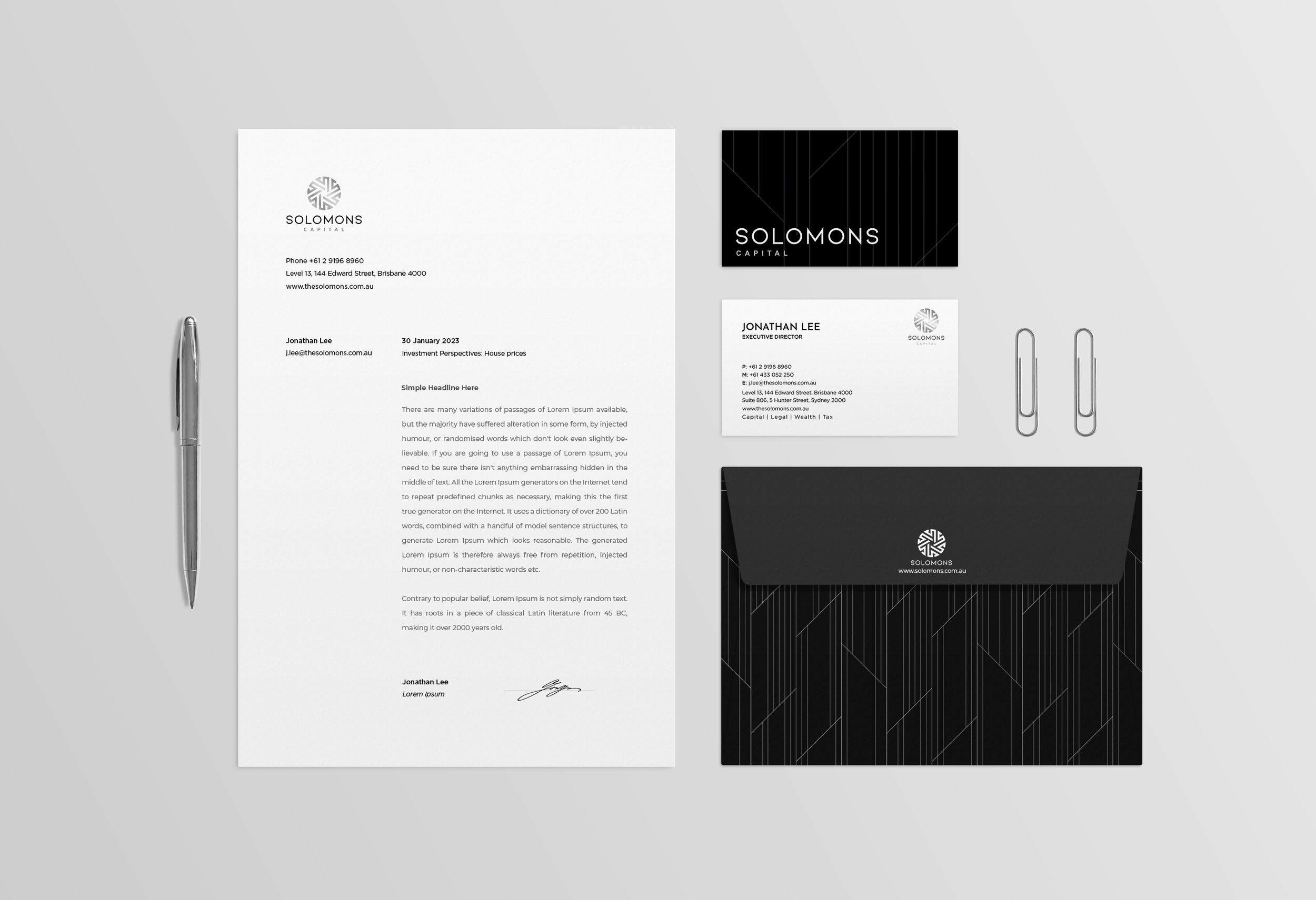
We also integrated Solomons Group’s interior design concept into our Branding design. The ascending lines intuitively guide people's eyes to the top—just like the Solomons Group constantly finds multiple pathways that lead clients to success.


NEXT PROJECT >>
NEXT PROJECT >>